Prescription Tracking Service - NHS

Current hospital pharmacy systems relied heavily on manual tasks, creating operational backlogs and longer waiting times for patients, posing a potential health risk that the hospital needed to address. Recognising this gap, we focused on the most congested parts of the process as an opportunity to streamline workflows and reduce pharmacists’ cognitive load. To ensure efficiency and consistency during development, I established a comprehensive design system and component library. This foundation enabled the rapid creation of high-fidelity, browser-native prototypes, accelerating development and delivering a smoother, more intuitive user experience.

Client

NHS

DELIVERABLES

Create an application that enables pharmacy staff to efficiently manage, track, and dispense prescriptions from receipt to completion.

Year

2023

Role

UX Designer

01 BACKGROUND

Designing for healthcare isn’t just about creating something that looks good. It’s about designing for safety, precision, and trust. Every decision has to align with strict regulations, patient safety protocols, and established clinical workflows. Accessibility and usability are not afterthoughts but fundamental to the design’s success.

When I joined this project, I knew a clean interface alone wouldn’t be enough, and the real challenge was ensuring our design worked within these constraints while still improving efficiency for healthcare staff. This case study shares how we built, tested, and launched a solution that met compliance standards and made day-to-day tasks faster, safer, and more intuitive for clinical teams.

02 RESEARCH

Getting pharmacists to discuss complex systems during busy hours proved to be quite challenging. Who would've thought, right? In the early stages of the project, we conducted structured, contextual interviews and surveys with participants to gain a deeper understanding of their use cases and struggles. We timed these throughout the product timeline, at the beginning to understand their goals and tasks, just before designing to inform about the user journey, during usability testing to ensure the flow ran smoothly and after we launched the system in hospitals to understand the usage of the product.

Research methods
Sorting through the responses to make sense required us to find a methological and unbiased way to process the data. An example of this was qualitative inductive coding for our exploration tasks. We looked at the interview transcripts and created a code for key words like 1 - Stock and 2 - Outdated and then later quantified these to give insight into what ideas were prevelant than others. We cross-analysed these and found connections between the data to then come up with our ideas to explore further.

Once we had our value proposition, I created a behavioural map to outline the end-to-end steps a user takes to acheive a target behaviour including actions, touchpoints and barriers.
We looked at structural barriers, psychological barriers, questions and unknowns and ideas and opportunities for each step of their existing journey for prescription management.


03 SOLUTIONS DISCOVERY

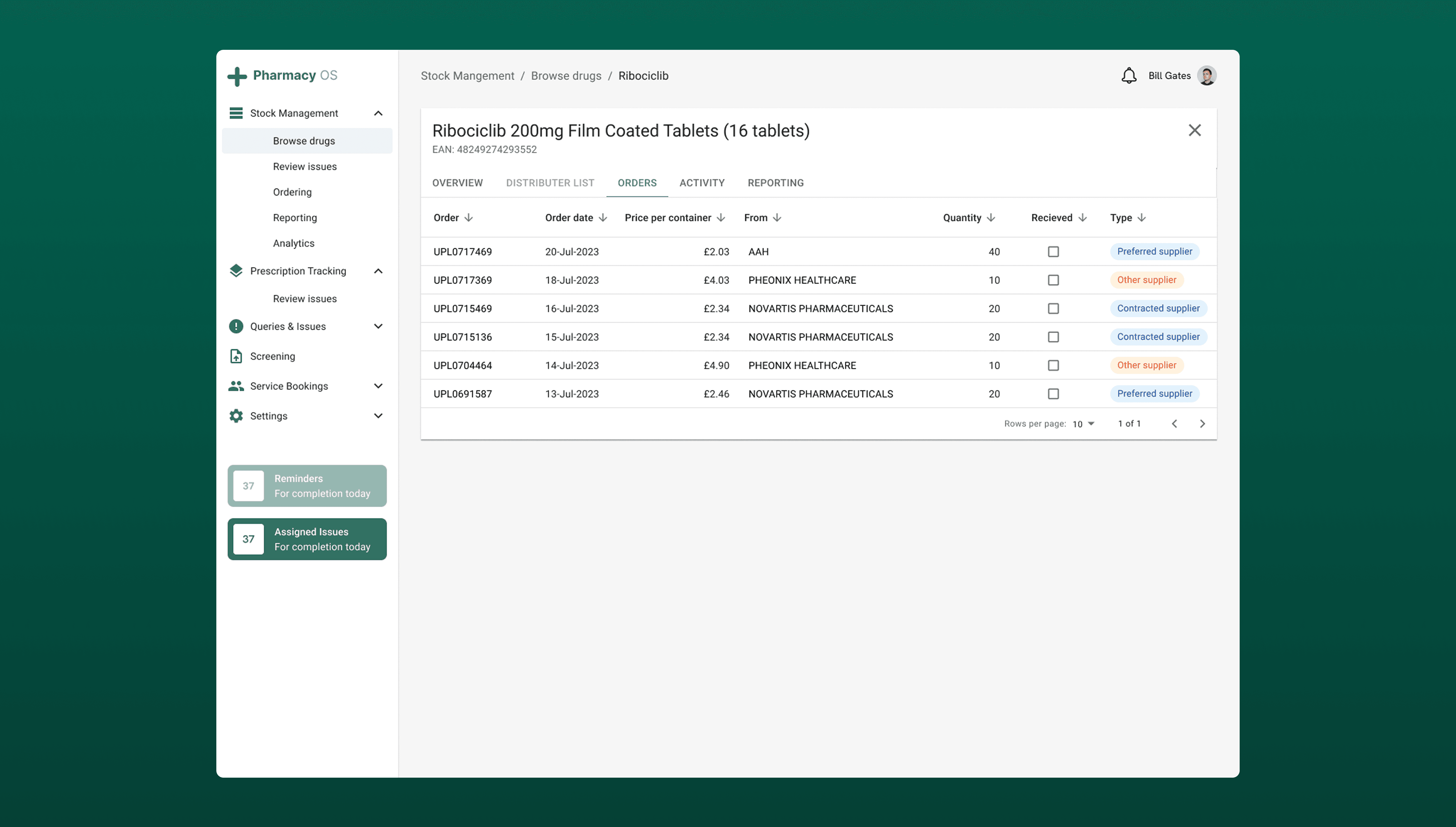
From our research, we found the systems used at the time were heavily reliant on manual processes, including printing and scanning prescriptions, handwritten annotations to adjust medication dosages and quantities, and the use of multiple systems to manage a single task.

I employed the RICE scoring method to prioritise which potential features to explore objectively across different areas such as potential impact, reach, effort required for each feature.

For the next 2 sprints we focused on:

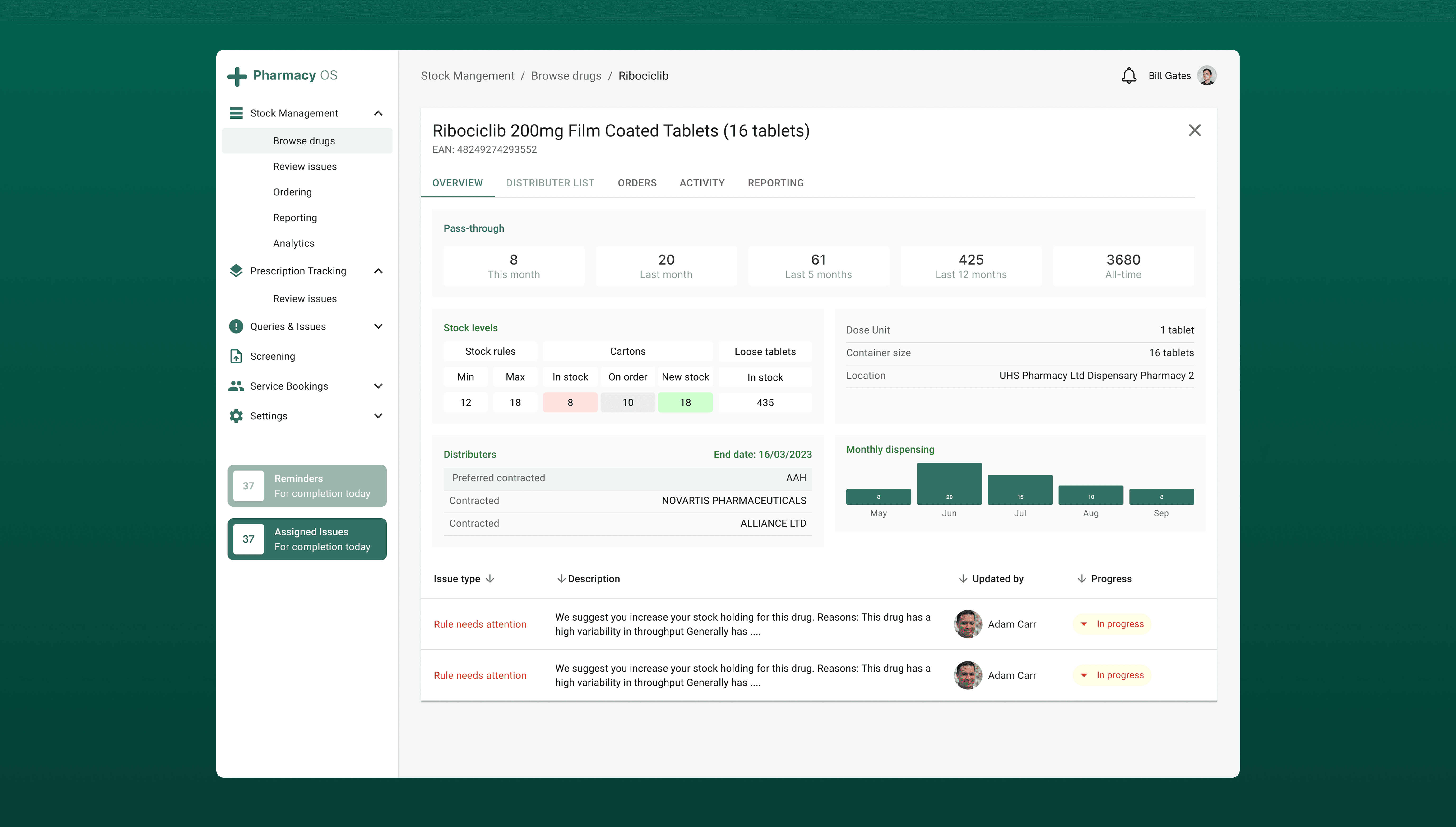
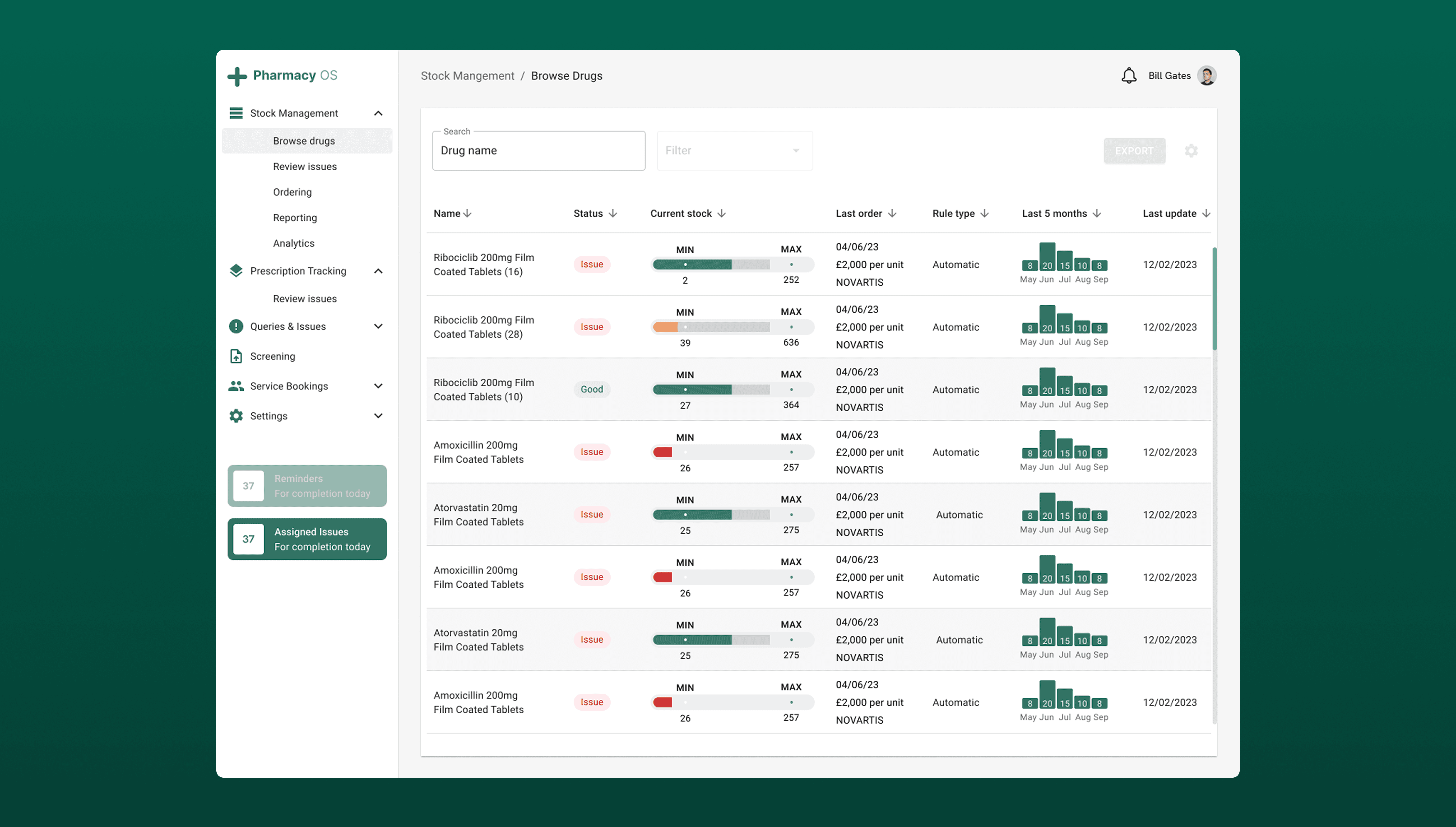
  1. Adding labelling guidance to streamline and automate prescription labelling and minimise room for errors.

  2. Clear update progress to reduce number of queries related to timing of prescriptions.

  3. Compulsory stock check entries to minimise the number of incorrect bookings being made on the system.

  4. Add a tagging system so users are aware of which responsilbities are allocated for them to handle.


04 WHAT OUTCOMES ARE WE TRYING TO DRIVE

We developed key metrics to accurately measure how well the system performs and to guide data-driven improvements. These metrics reveal what’s working, highlight areas for optimisation, and help ensure we focus on meaningful outcomes. Key metrics are important for me for two main reasons

Goal-setting – Key metrics define clear targets and measure progress, ensuring efforts stay aligned with the right objectives rather than just activity.

Performance monitoring – They track performance over time, helping to spot trends and address potential issues early.

This is how I am sure that I am making informed decisions that align with company’s goals and objectives.


Outcome

How we'll measure it

Labelling rules for prescriptions are adhered to and used

[Metric] # of users who have viewed the rules
[Metric] # of labelling errors after implementation

Clear understanding of responsibility within the team

[Metric] # of queries waiting after 48 hours
[Qualitative] Of the pharmacy team using the tool, what reasons did they have for not completing a prescription?

Faster dispensing cycle – Less time spent answering timing questions means more time spent on actual dispensing.

[Metric] # Track the number of prescription-timing queries logged

[Metric] # Percentage of prescriptions dispensed on or before estimated time


05 SOLUTIONS & RESULTS

My approach focused on streamlining the prescribing process to deliver a smoother, more efficient platform for dispensing medication. After launch, prescription queries dropped by 35% thanks to clearer team responsibilities. Simple UX enhancements, such as a tagging system, enabled users to allocate enquiries and resolve tasks more quickly.

Usability testing confirmed these improvements: users reported that the new system was easier to use, analytics showed fewer clicks per task, and average prescription dispensing times fell from 11 minutes to just 6 minutes.


06 DID WE SOLVE OUR PROBLEM?

Yes. Our goal was to reduce delays and confusion in prescription dispensing and the results above demonstrated a direct solution to the original problem. From a business perspective, faster dispensing meant more prescriptions processed per day, reducing overtime costs and freeing pharmacists to focus on clinical care.


07 WHAT I WOULD DO DIFFERENTLY

Next time, I’d run an additional pilot with a live but low-risk prescription queue before full rollout. This would let us observe real-time bottlenecks (e.g., peak-hour handovers) that are harder to detect in moderated usability tests. I’d also set up automated dashboards (possibly in Power BI) from day one to continuously track dispensing times, tagging usage, and common error points, so we could act on data trends immediately rather than waiting for a post-launch review.